A digital experience designed to present a lighter way of life.
The challenge was to translate the new Aurora Bem Leve product line into a digital presence capable of communicating healthier choices in a simple, attractive and approachable way — without giving up flavor, practicality or brand recognition.

Healthier choices with lightness, flavor and familiarity.
The visual direction brings the healthy-food territory closer to a more everyday and accessible language. Natural tones, strong product presence and lighter compositions help communicate well-being without making the experience feel technical or restrictive.
Light, natural and inviting.
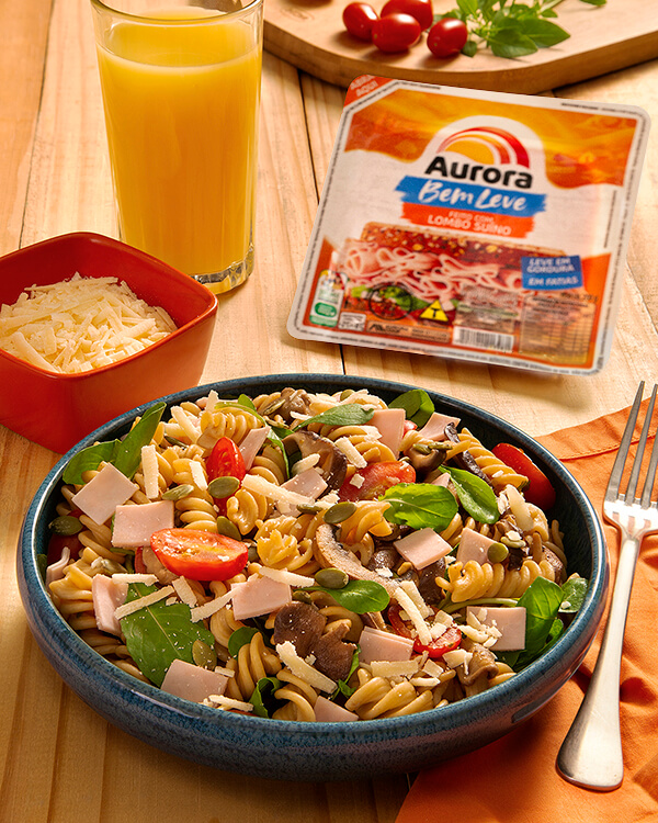
Food imagery and real consumption moments take center stage, while concise headlines and generous spacing create a simpler, more fluid reading experience.
A palette connected to well-being.
Greens support the healthier-living territory, yellows add energy and lighter tones preserve a sense of ease throughout the experience.
A narrative that introduces the concept before the product.
The experience starts with the idea of healthier choices, introduces the Bem Leve proposition and guides consumers through benefits, products, consumption occasions and recipes. The complete page can be explored in the panel alongside the mapped sections.

The product becomes part of the visual narrative.
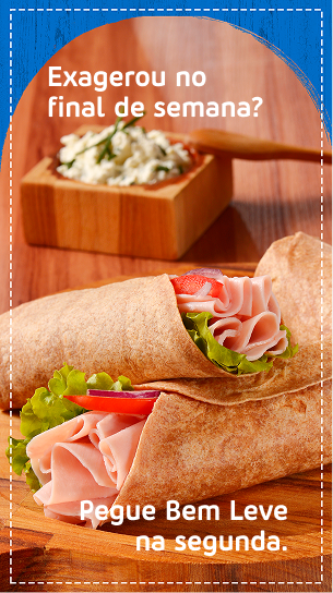
From the well-being message to product choice.
Instead of treating the new line as a catalog, the page builds context for choice: it introduces the healthier-living territory, presents benefits and connects products to meals, habits and recipes that fit everyday life.
Content that extends the experience beyond packaging.
Recipes and serving suggestions turn the line’s positioning into real situations. The experience moves beyond product attributes to show how Bem Leve can become part of a more balanced routine.
See the complete experience.
Explore the published Aurora Bem Leve page and see how concept, benefits, products and recipes were organized into a single digital narrative.