A digital identity to make AI and data easier to understand.
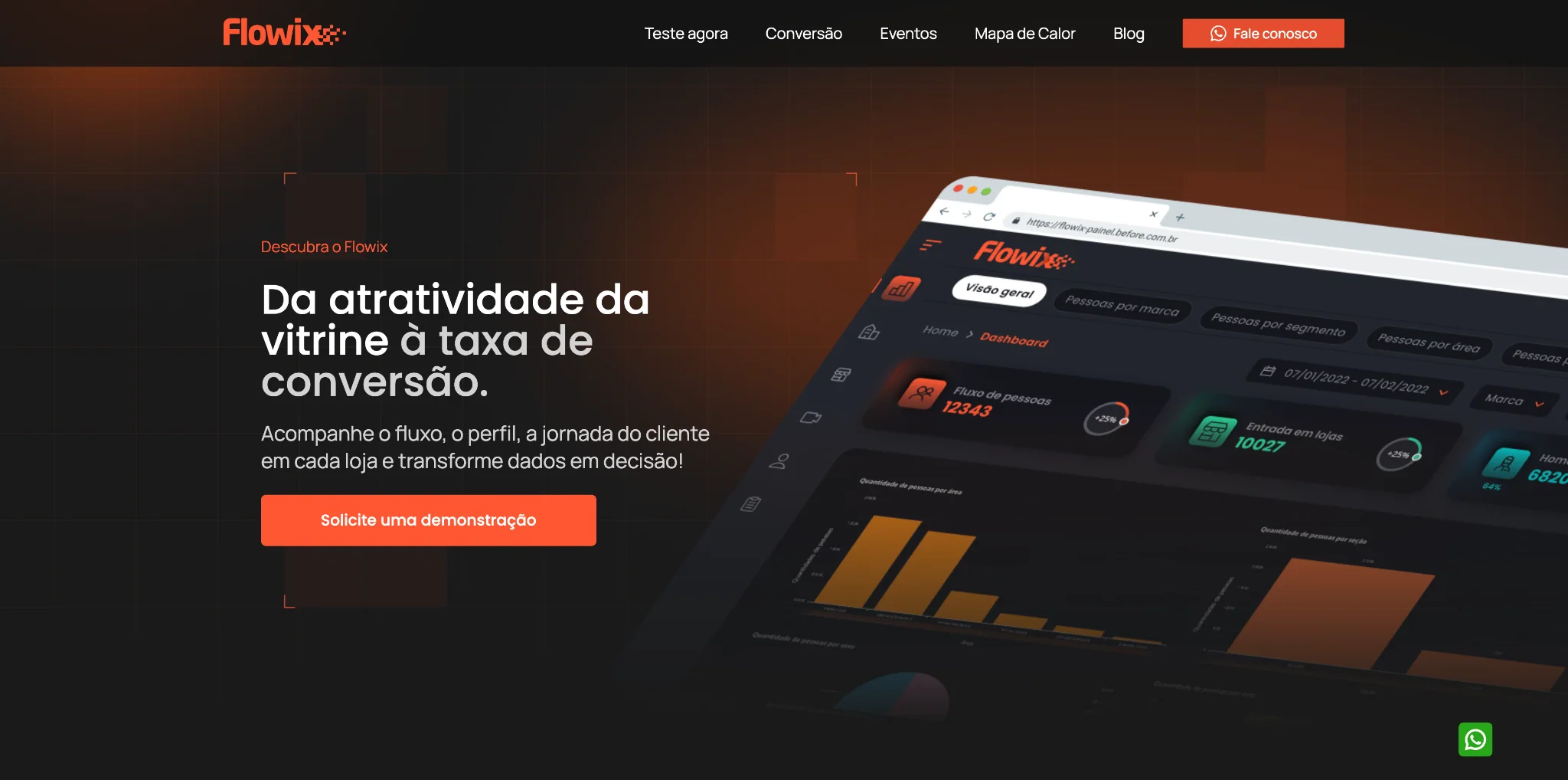
The site presents Flowix as a platform capable of tracking traffic, profile, journey and conversion in physical spaces — connecting technology to practical business decisions.
An experience built to explain complex technology without feeling complex.
The UI direction combines a dark base, high contrast, orange accents and imagery connecting cameras, behavior and dashboards. The visual goal was to maintain a strong sense of technology without distancing retail audiences.
Dark, analytical and retail-driven.
Flowix
High-contrast typography and direct headlines create fast reading across content blocks and product demonstrations.
The first impression needed to communicate technology and results at the same time.
The homepage starts with the value proposition — tracking customer traffic, profile and journey — and uses the dashboard as the main visual proof of the product.

Technology explained through real retail situations.
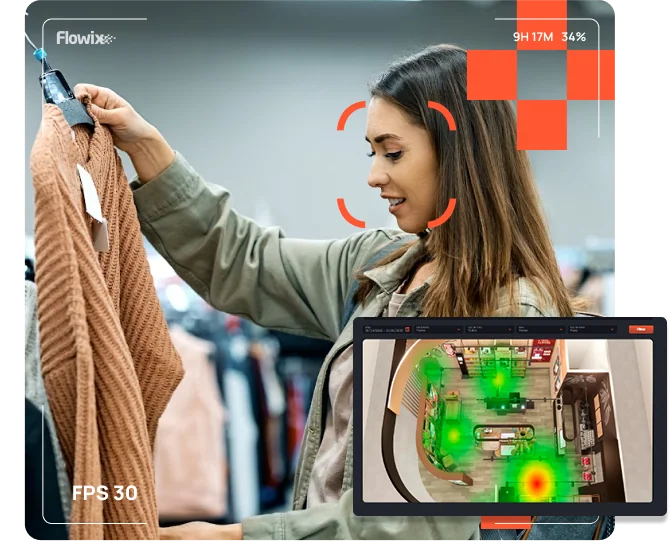
Real-time heatmap
The visual concept connects the physical environment to data, showing interest, dwell time and circulation immediately.
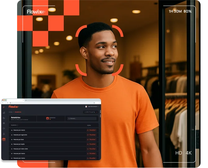
Profile and behavior
Photography, overlays and dashboard elements help explain how the platform turns imagery into strategic information.
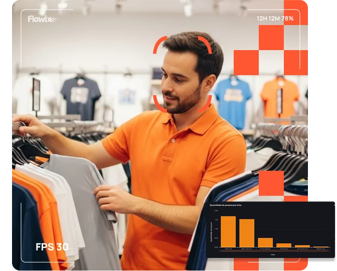
Storefronts and displays
The visual composition highlights the relationship between attention, interaction and performance of spaces inside the store.
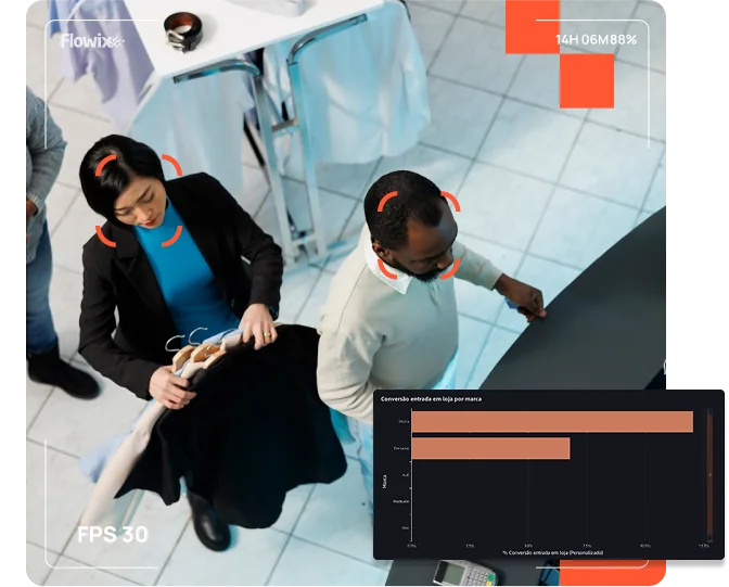
From traffic to sales
The visual narrative connects behavior and outcomes, reinforcing the product's commercial value beyond the technology.
A consistent visual system from product to marketing.
Contrast to highlight information.
Dark surfaces create depth, while orange identifies attention points, data and important calls to action.
A digital presence designed to turn technology into perceived value.
The result is a visual experience aligned with the product: analytical, technological and retail-oriented, yet simple enough to communicate the benefit quickly.
View the live project
Access the full experience and browse the sections designed to communicate Flowix's proposition, features and benefits.